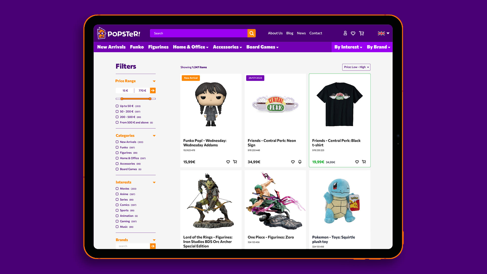
As a designer & partner in SEMITONE Design Studio, I designed the brand identity and website of a collectibles shop named Popster.
Three friends with a love for pop culture founded Popster, a company offering figurines, board games, and other accessories. We named the company, crafted its brand identity, and designed its e-commerce site, aiming to convey a friendly, knowledgeable character that values clients’ leisure time.
The name “Popster” captures the brand’s enthusiasm for pop culture, suitable for a person or company alike. We noticed the “pop” in the name resembled eyes, inspiring Popster’s mascot, who can adapt to any character—from cowboy to astronaut—while maintaining its identity with signature glasses, shapes, and brand colors. The orange and purple palette adds playfulness, while the Commissioner typeface balances the identity with weights that range from playful to professional.
For Popster’s e-commerce site, we layered playful and functional elements. Bold titles and clean body text define the typography, with brand colors strategically applied: purple dominates in brand-centric pages, while white and gray promote usability in functional sections. Orange highlights clickable elements, reinforcing the brand’s engaging, user-friendly design.